Every SNOTEL station in the OutsideDB snow dashboard links to its own National Weather Service point forecast — a hyper-local 7-day outlook generated for the exact coordinates of that station. We've been storing both sides of that equation: what the NWS predicted for each station, and what the SNOTEL sensors actually measured when that day arrived. With enough data accumulated, we can start asking a simple question: how well do the NWS snowfall forecasts hold up against observed reality?
What follows is an initial look — not a comprehensive study, but a first pass at the patterns the data reveals over a 13-day window during an active storm period. We're presenting the numbers as they are and leaving interpretation to the reader. There's more analysis to do, and we'll follow up with a deeper look as the dataset grows.
Setting the Stage: What We Measured and How
The NWS issues point forecasts for specific lat/lon coordinates through the weather.gov API. For each SNOTEL station, these forecasts include a snow minimum and snow maximum for each forecast period — essentially a range expressing the expected snowfall. We store these forecasts twice daily as they're issued, then compare the forecasted range against what the SNOTEL sensor actually recorded in 24-hour accumulation.
The comparison metric used here is the snow forecast midpoint — the average of snow_min and snow_max — compared against observed accumulation. Mean Absolute Error (MAE) measures how far off predictions are on average without regard to direction. Bias measures the systematic direction of error: negative bias means the NWS is consistently forecasting more snow than falls (over-forecasting), while positive bias means less snow was forecasted than actually fell (under-forecasting).
One important context note: this 13-day window covered March 4–17, 2026 — a period that included the significant Pacific storm system that hit the Northwest around March 11–14. That event produced some of the largest 4-day accumulation totals of the season in the Washington Cascades, and it almost certainly influences several of the metrics below, particularly for Washington state. We've noted where the storm's influence is likely visible in the data.
This is also a relatively short window. Thirteen days across 754 stations gives us nearly 27,000 data points — a reasonable starting sample — but it's a single snapshot in a single season with an unusually large event in the middle of it. Patterns observed here warrant attention but not strong conclusions until validated against a longer record.
Overall Accuracy: How Far Off Are the Forecasts?
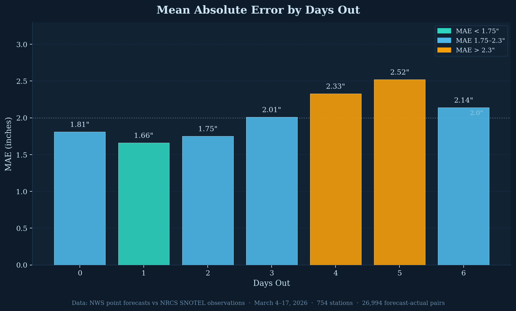
The first chart shows mean absolute error at each forecast horizon from same-day (Day 0) through six days out (Day 6). The pattern is roughly what you'd expect from any weather model — accuracy degrades as the forecast horizon extends — though the degradation isn't perfectly linear and the Day 6 value (2.14") is actually lower than Day 5 (2.52"), which may reflect statistical noise in the sample or the way NWS formats its longer-range periods.
Day 1 shows the lowest MAE at 1.66 inches, which is somewhat counterintuitive — you might expect the same-day forecast (Day 0) to be most accurate. The Day 0 reading of 1.81" may be elevated because it captures the NWS forecast issued the morning of a day that then saw unexpectedly large accumulation during the storm period. By Day 3 the MAE crosses 2 inches, and Days 4 and 5 are where the meaningful degradation appears at 2.33" and 2.52" respectively.
For context: a 2-inch MAE on a no-snow day is meaningless, but on a day with 4-6 inches of accumulation it means the forecast could be off by half the total. On a 20-inch storm day, a 2-inch average error sounds reasonable — but average error is not the same as individual storm error, which brings us to the next chart.
The Direction of Error: NWS Consistently Over-Forecasts Snow
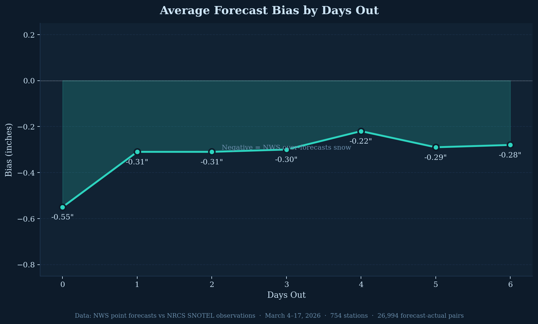
Across all 7 forecast horizons in this dataset, the NWS bias is negative — meaning the NWS point forecast midpoint exceeded actual accumulation at SNOTEL stations more often than not. The magnitude ranges from -0.55 inches on the same-day forecast to around -0.22 to -0.31 inches for Day 1 through Day 6 forecasts.
In this dataset, the NWS snowfall forecast ran higher than observed accumulation by roughly a quarter to a half inch per day on average. The same-day forecast carried the largest average overestimate at 0.55 inches. The state-level breakdown later in this article shows this pattern is not uniform across all states.
How Wide Is the Uncertainty Band?
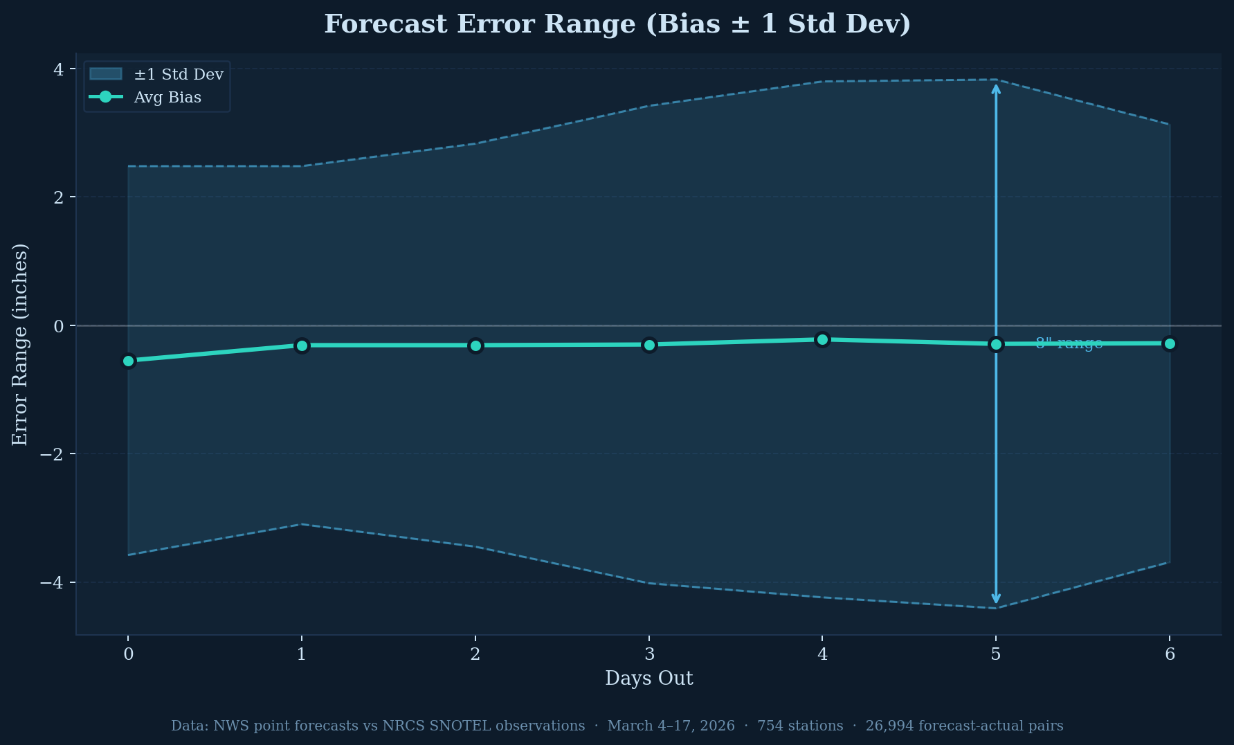
The error range chart adds standard deviation bands around the average bias, showing the spread of individual forecast errors. While the average bias line stays close to zero, the band around it is wide and expands with time.
At the same-day forecast the ±1 standard deviation band spans roughly 6 inches total. By Day 5 that band has grown to approximately 8 inches. Individual station forecasts on individual days can deviate substantially from the average — and that spread increases at longer forecast horizons.
Large Storm Events: Where Forecast Uncertainty Increases
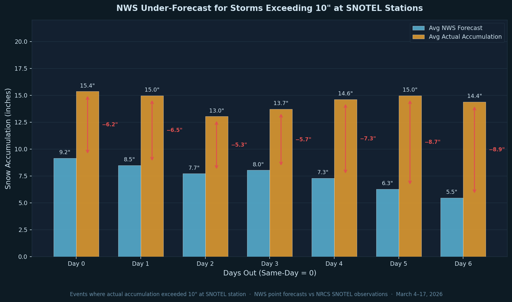
When actual accumulation at a SNOTEL station exceeded 10 inches, the NWS point forecast consistently fell well short of what fell. Across this period, the average NWS forecast for these events ranged from 5.5 to 9.2 inches depending on forecast horizon — while actual accumulation averaged 13 to 15 inches. The gap between forecast and reality ranged from 5.3 to 8.9 inches across all seven forecast horizons, and the under-forecast is consistent at every day out.
This is the opposite direction from the overall bias shown earlier. While the average forecast across all conditions runs slightly high, when large snow events actually occur the forecast runs substantially low. The forecast identifies that snow is coming, but the quantity falls well short of what the storm ultimately delivers. The gap also tends to grow at longer horizons — at Day 5 and Day 6 the average under-forecast exceeds 8 inches.
When a point forecast is showing a major snow event, the data from this period suggests treating the forecast as a floor rather than a target. Checking multiple sources — nearby stations, the NWS forecast discussion, and local avalanche center outlooks — provides more context on the likely upper range.
Geographic Variation: State-Level Bias
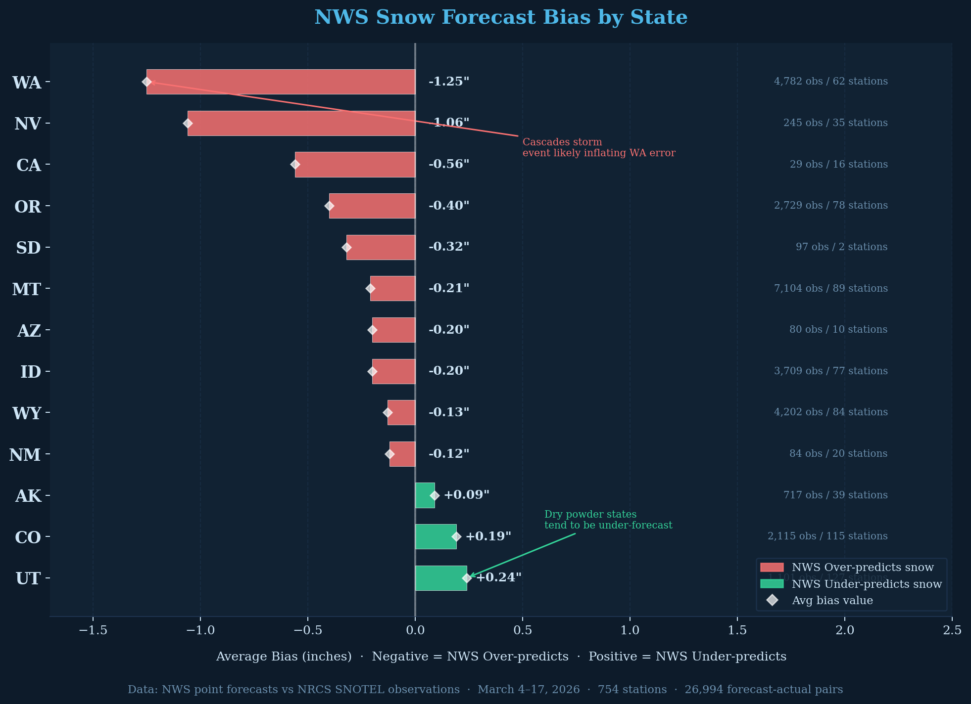
The state-level breakdown reveals that the systematic over-forecasting is not uniform — it varies substantially by geography, and there's a geographic pattern worth noting.
Washington leads all states with a -1.25 inch average bias, though the chart itself flags that the Cascades storm event during this period is likely inflating that number. Nevada is second at -1.06 inches, followed by California (-0.56"), Oregon (-0.40"), and South Dakota (-0.32"). Montana (-0.21"), Arizona (-0.20"), Idaho (-0.20%), and Wyoming (-0.13%) show smaller but still negative bias. The pattern leans toward Pacific-influenced states carrying larger over-forecast bias.
The exceptions are notable. Alaska (+0.09"), Colorado (+0.19"), and Utah (+0.24%) are the three states where the NWS under-forecasted on average — where less snow was predicted than actually fell. The chart annotation points to "dry powder states" as a possible explanation: in drier, colder continental snowpack environments, the NWS may systematically underestimate snowfall in a way that inverts the coastal pattern. Whether this reflects something structural about how the NWS models handle different precipitation regimes is a question this dataset can't fully answer.
California's sample is small (only 16 stations and 29 observations), so the -0.56" bias there should be treated with caution. Montana and Wyoming have the largest sample sizes in the dataset (89 and 84 stations respectively) and their bias numbers are likely the most statistically stable.
Snow Density and Forecast Bias: A Clear Gradient
Breaking the data down by snow density — the ratio of SWE to snow depth — reveals a pattern that the overall bias numbers obscure. Density indicates the character of the snowpack: fresh dry powder runs around 6–10%, typical settled mountain snow is 20–35%, and wet coastal pack can exceed 40%.
| Density Band | Obs | Avg Bias | MAE |
|---|---|---|---|
| Light <10% | 60 | +2.52" | 3.16" |
| Medium 10–15% | 156 | +4.30" | 5.15" |
| Dense 15–20% | 547 | +2.17" | 3.93" |
| Very Dense 20–25% | 3,457 | +0.81" | 2.73" |
| Very Dense 25–30% ≈ neutral | 6,904 | −0.11" | 1.81" |
| Very Dense 30–40% | 12,136 | −0.72" | 1.75" |
| Wet Pack >40% | 2,674 | −1.52" | 2.04" |
The gradient is consistent across the full density range. Lighter snow conditions — fresh, fluffy, low-density — show under-forecasting throughout, with NWS predicting less snow than actually fell. As density increases, bias moves steadily toward over-forecasting. The inflection point sits at the 25–30% band, which shows essentially no bias at -0.11".
Above 30% density — the settled, heavier snowpack that dominates much of the western SNOTEL network — NWS consistently over-forecasts. The wet pack category (>40%) shows the strongest over-forecast signal at -1.52". This is the wet coastal-style snowpack found across the Washington and Oregon Cascades, which also aligns with Washington's -1.25" state bias in the state-level chart.
The 30–40% band alone accounts for 12,136 of the 26,994 total observations — nearly half the dataset. That single density band, with its -0.72" over-forecast bias, is largely responsible for the negative bias seen across the overall charts. The lighter density bands (under 20%) collectively represent fewer than 800 observations, so those results are directionally interesting but statistically thin.
What this data shows for the March 4–17 period: forecast bias appears to track consistently with snow density, running from under-forecast for dry fluffy conditions through approximately neutral at 25–30% and into over-forecast territory for denser settled and wet pack. Whether this gradient persists across a full season and across more varied storm types is a question for a longer-term analysis.
What the Data Does and Doesn't Tell Us
If this data shows anything first, it's that forecasting snowfall in mountainous terrain is genuinely difficult. Complex topography, variable storm tracks, and the wide range of snow types across elevation all contribute to forecast uncertainty that no model fully resolves.
Taken together, the initial picture from this 13-day window shows a system that performs reasonably well on average — 1.7 to 2.5 inches MAE is workable for most planning purposes — but carries a consistent over-forecast skew across most states and shows higher uncertainty when large storm events are in the forecast.
There are real limitations to this analysis. Thirteen days is a short window covering an unusually active storm period. The March 11–14 Cascade event almost certainly inflates error and bias metrics for Washington and possibly the network-wide numbers. A longer record spanning multiple seasons and a range of storm types would give more confidence in any of these patterns. We also haven't yet broken down performance by elevation band, by precipitation type (pure snow vs. mixed events), or by how the NWS min-max range relates to accuracy — all of which are worth exploring in follow-up analysis.
None of that makes NWS point forecasts less useful — they remain one of the best free tools available for backcountry trip planning. Knowing where the systematic tendencies lie helps you read a forecast more accurately: treat a big storm forecast as a likely floor, use nearby SNOTEL stations to ground-truth what's actually falling, and pair the forecast with local avalanche center outlooks for context. Used that way, the point forecast is a valuable part of the planning picture.
What the data clearly shows is that building a systematic comparison between NWS point forecasts and SNOTEL observations produces interesting and potentially useful signal. We'll continue collecting the data and plan to revisit this analysis with a larger dataset and more detailed breakdowns in a future post.